Hi,
In the previous article, 'K-Means Clustering - 1 : Basic Understanding', we understood what is K-Means clustering, how it works etc. In this article, we will use k-means functionality in Scipy for data clustering. OpenCV will be covered in another article.
Scipy's cluster module provides routines for clustering. The vq module in it provides k-means functionality. You will need Scipy version 0.11 to get this feature.
We also use Matplotlib to visualize the data.
Note : All the data arrays used in this article are stored in github repo for you to check. It would be nice to check it for a better understanding. It is optional. Or you can create your own data and check it.
So we start by importing all the necessary libraries.
>>> import numpy as np
>>> from scipy.cluster import vq
>>> from matplotlib import pyplot as plt
Here I would like to show three examples.
1 - Data with only one feature :
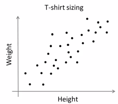
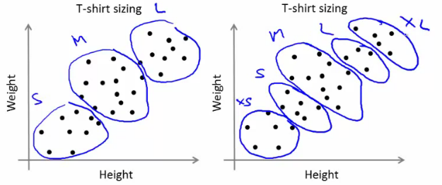
Consider, you have a set of data with only one feature, ie one-dimensional. For eg, we can take our t-shirt problem where you use only height of people to decide the size of t-shirt.
Or, from an image processing point of view, you have a grayscale image with pixel values ranges from 0 to 255. You need to group it into just two colors, may be black and white only. ( That is another version of thresholding. I don't think someone will use k-means for thresholding. So just take this as a demo of k-means.)
So we start by creating data.
>>> x = np.random.randint(25,100,25)
>>> y = np.random.randint(175,255,25)
>>> z = np.hstack((x,y))
>>> z = z.reshape((50,1))
So we have 'z' which is an array of size 50, and values ranging from 0 to 255. I have reshaped 'z' to a column vector. It is not necessary here, but it is a good practice. Reason, I will explain in coming sections. Now we can plot this using Matplotlib's histogram plot.
>>> plt.hist(z,256,[0,256]),plt.show()
We get following image :
 |
| Test Data |
Now we use our k-means functions.
First function, vq.kmeans(), is used to cluster the data as per our requirements and it returns the centroids of the clusters. (Docs)
It takes our test data and number of clusters we need as inputs. Other two inputs are optional and is not of big concern now.
>>> centers,dist = vq.kmeans(z,2)
>>> centers
array([[207],
       [ 60]])
First output is 'centers', which are the centroids of clustered data. For our data, it is 60 and 207. Second output is the distortion between centroids and test data. We mark the centroids along with the inputs.
>>> plt.hist(z,256,[0,256]),plt.hist(centers,32,[0,256]),plt.show()
Below is the output we got. Those green bars are the centroids.
 |
| Green bars shows centroids after clustering |
Now we have found the centroids. From first article, you might have seen our next job is to label the data '0' and '1' according to distance to the centroids. We use vq.vq() function for this purpose.
vq.vq() takes our test data and centroids as inputs and provides us the labelled data,called 'code' and distance between each data and corresponding centroids.
>>> code, distance = vq.vq(z,centers)
If you compare the arrays 'code' and 'z' in git repo, you can see all values near to first centroid will be labelled '0' and next as '1'.
Also check the distance array. 'z[0]' is 47, which is near to 60, so labelled as '1' in 'code'. And distance between them is 13, which is 'distance[0]'. Similarly you can check other data also.
Now we have the labels of all data, we can separate the data according to labels.
>>> a = z[code==0]
>>> b = z[code==1]
'a' corresponds to data with centroid = 207 and 'b' corresponds to remaining data. (Check git repo to see a&b).
Now we plot 'a' in red color, 'b' in blue color and 'centers' in yellow color as below:
>>> plt.hist(a,256,[0,256],color = 'r') # draw 'a' in red color
>>> plt.hist(b,256,[0,256],color = 'b') # draw 'b' in blue color
>>> plt.hist(centers,32,[0,256],color = 'y') # draw 'centers' in yellow color
>>> plt.show()
We get the output as follows, which is our clustered data :
 |
| Output of K-Means clustering |
So, we have done a very simple and basic example on k-means clustering. Next one, we will try with more than one features.
2 - Data with more than one feature :
In previous example, we took only height for t-shirt problem. Here, we will take both height and weight, ie two features.
Remember, in previous case, we made our data to a single column vector. This is because, it is a good convention, and normally followed by people from all fields. ie each feature is arranged in a column, while each row corresponds to an input sample.
For example, in this case, we set a test data of size 50x2, which are heights and weights of 50 people. First column corresponds to height of all the 50 people and second column corresponds to their weights. First row contains two elements where first one is the height of first person and second one his weight. Similarly remaining rows corresponds to heights and weights of other people. Check image below:
So now we can prepare the data.
>>> x = np.random.randint(25,50,(25,2))
>>> y = np.random.randint(60,85,(25,2))
>>> z = np.vstack((x,y))
Now we got a 50x2 array. We plot it with 'Height' in X-axis and 'Weight' in Y-axis.
>>> plt.scatter(z[:,0],z[:,1]),plt.xlabel('Height'),plt.ylabel('Weight')
>>> plt.show()
(Some data may seem ridiculous. Never mind it, it is just a demo)
 |
| Test Data |
Now we apply k-means algorithm and label the data.
>>> center,dist = vq.kmeans(z,2)
>>> code,distance = vq.vq(z,center)
This time, 'center' is a 2x2 array, first column corresponds to centroids of height, and second column corresponds to centroids of weight.(Check git repo data)
As usual, we extract data with label '0', mark it with blue, then data with label '1', mark it with red, mark centroids in yellow and check how it looks like.
>>> a = z[code==0]
>>> b = z[code==1]
>>> plt.scatter(a[:,0],a[:,1]),plt.xlabel('Height'),plt.ylabel('Weight')
>>> plt.scatter(b[:,0],b[:,1],c = 'r')
>>> plt.scatter(center[:,0],center[:,1],s = 80,c = 'y', marker = 's')
>>> plt.show()
This is the output we got :
 |
| Result of K-Means clustering |
So this is how we apply k-means clustering with more than one feature.
Now we go for a simple application of k-means clustering, ie color quantization.
3 - Color Quantization :
Color Quantization is the process of reducing number of colors in an image. One reason to do so is to reduce the memory. Sometimes, some devices may have limitation such that it can produce only limited number of colors. In those cases also, color quantization is performed.
There are lot of algorithms for color quantization. Wikipedia page for color quantization gives a lot of details and references to it. Here we use k-means clustering for color quantization.
There is nothing new to be explained here. There are 3 features, say, R,G,B. So we need to reshape the image to an array of Mx3 size (M is just a number). And after the clustering, we apply centroid values (it is also R,G,B) to all pixels, such that resulting image will have specified number of colors. And again we need to reshape it back to the shape of original image. Below is the code:
import cv2
import numpy as np
from scipy.cluster import vq

img = cv2.imread('home.jpg')
z = img.reshape((-1,3))

k = 2           # Number of clusters
center,dist = vq.kmeans(z,k)
code,distance = vq.vq(z,center)
res = center[code]
res2 = res.reshape((img.shape))
cv2.imshow('res2',res2)
cv2.waitKey(0)
cv2.destroyAllWindows()
Change the value of 'k' to get different number of colors. Below is the original image and results I got for values k=2,4,8 :
 |
| Color Quantization with K-Means clustering |
So, that's it !!!
In this article, we have seen how to use k-means algorithm with the help of Scipy functions. We also did 3 examples with sufficient number of images and plots. There are two more functions related to it, but I will deal it later.
In next article, we will deal with OpenCV k-means implementation.
I hope you enjoyed it...
And if you found this article useful, don't forget to share it on Google+ or facebook etc.
Regards,
Abid Rahman K.
Ref :
1 - Scipy cluster module documentation
2 - Color Quantization


